Nokia’s potential redesign of WP UI
If you have had a chance to interact with a windows phone then you will
agree with me that they have the ugliest UI as compared to IOS and Android
devices. This might change if what appears below was ever to come to life. I must
say it does not look all that but you never know what will happen if it is
enhanced with animations and stuff…
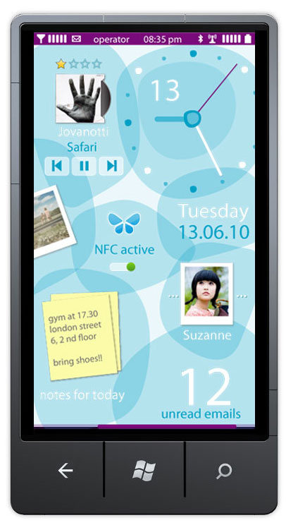

What you’re looking at is supposedly one of several screenshots that could
have been Nokia’s Windows Phone UI. Though Nokia had full freedom to change WP
UI as they wish, they seem to want to stick to the more cohesive Metro – at
least for the current Lumias anyway.
These designs are just personal designs apparently by a Nokia designer and
apparently not part of any Nokia project. That particular designer had moved to
Accenture in 2011 so would likely not be in a team close to WP Nokia
development now.
PocketNow thinks that it might be in Nokia’s best interest to push
consistent UI experiences with Metro across Windows Phone, Windows 8 tablets
and Xbox.
It’s difficult to judge the UI as they are just
static screenshots and animation could enhance it a little. This is just the
homescreen (or is it? could be lock screen and homescreen). We don’t know what
everything else might look like
Comments
Post a Comment
Be sure to check back again because I do make every effort to reply to your comments here. Karibu :)